In this task we had to analyse three different music magazines, I analysed three front covers, three contents pages and three double page spreads.
Monday, 26 September 2011
Monday, 19 September 2011
Preliminary Task
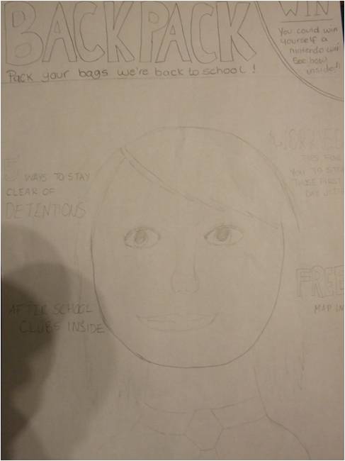
For the preliminary task we were required to create a front cover and a contents page for a school magazine. Before creating my magazine I decided to draw out some ideas on some A4 paper. Before sketching out the possible images and sell lines, I first thought of my masthead - eventually I decided to call my magazine 'Backpack' as I thought this directly related to my target audience of year 7's. I then went on to draw out the rest of my ideas on the paper.


Once I finished drawing out my ideas I used a digital camera to capture some of the images I wanted to include on my magazine front cover and contents page - once taken I uploaded these pictures onto the computer ready for me to create my magazine.
 I created my magazine front cover and contents page in Adobe Photoshop. I began by creating an A4 page by selecting the 'International Newspaper' option; this was then followed by inserting the images that I took. I decided to create my magazine front cover first therefore the first image I inserted was my main image (this opened up in a new window) - my main image consisted of a young student smiling at the camera. Having the model smiling at the camera created a friendly environment for the target audience therefore, this would be useful as it persuades the reader to buy the magazine as they find it appealing and welcoming. To cut my model out of the background I used the 'magic wand' tool to select the background, therefore I could simply delete the selection and it would leave me with just the model image - to smooth the edges and to edit the photo I used the 'heal tool'. I then dragged the image into the main A4 document. Next I created my masthead I did this by creating a new layer and using the ' horizontal text tool' to create a text box - in the text box I wrote the masthead 'Backpack', I decided to change the font to 'Impact' as this is quite a bold and eye-catching font, I then changed the colour to a bright red, the reason for this is because red is quite a bright and vibrant colour therefore it will attract the audiences attention. Underneath this (in the font Times New Roman) I added the tagline "Pack you're bags were back to school!" as the linked well with my masthead - I decided to change the colour of this to orange as it combined well with the red.
I now added in my various sell lines which all directly related to the audience of year 7's e.g. as year 7's will all be starting school one sell line which I included was: " Worried? The best tips to calm your nerves". I also varied the use of the colours orange and red to keep a consistent theme. These were again created using the 'horizontal text tool'.
 I now began to create my contents page which was also created in Adobe Photoshop. I again used the font 'Impact' for the title 'Contents' and I stuck with the red and orange colour scheme to create a continual theme. To the side of the title I added in the Haydon stag to reinforce the idea that this is a school magazine and to make the page look more professional. Next I added in the page numbers and titles - this was done by using the 'horizontal text tool' I then aligned the text to the left. Following this I inserted the rest of the images I took on the digital camera which included a picture of salad, a school bag, and two blacked out images of people. To cut these pictures out of the background I 'quick mask' tool - to blackout the images I just used the basic 'brush tool'. Around these three pictures I created a small box to put behind - I clicked on the fx button here I selected 'Drop Shadow', 'Outer glow' and 'Bevel and Emboss' to give a slight 3D effect.

Once I finished drawing out my ideas I used a digital camera to capture some of the images I wanted to include on my magazine front cover and contents page - once taken I uploaded these pictures onto the computer ready for me to create my magazine.
 I created my magazine front cover and contents page in Adobe Photoshop. I began by creating an A4 page by selecting the 'International Newspaper' option; this was then followed by inserting the images that I took. I decided to create my magazine front cover first therefore the first image I inserted was my main image (this opened up in a new window) - my main image consisted of a young student smiling at the camera. Having the model smiling at the camera created a friendly environment for the target audience therefore, this would be useful as it persuades the reader to buy the magazine as they find it appealing and welcoming. To cut my model out of the background I used the 'magic wand' tool to select the background, therefore I could simply delete the selection and it would leave me with just the model image - to smooth the edges and to edit the photo I used the 'heal tool'. I then dragged the image into the main A4 document. Next I created my masthead I did this by creating a new layer and using the ' horizontal text tool' to create a text box - in the text box I wrote the masthead 'Backpack', I decided to change the font to 'Impact' as this is quite a bold and eye-catching font, I then changed the colour to a bright red, the reason for this is because red is quite a bright and vibrant colour therefore it will attract the audiences attention. Underneath this (in the font Times New Roman) I added the tagline "Pack you're bags were back to school!" as the linked well with my masthead - I decided to change the colour of this to orange as it combined well with the red.
I now added in my various sell lines which all directly related to the audience of year 7's e.g. as year 7's will all be starting school one sell line which I included was: " Worried? The best tips to calm your nerves". I also varied the use of the colours orange and red to keep a consistent theme. These were again created using the 'horizontal text tool'.

Subscribe to:
Posts (Atom)