Over the past few weeks I have been working on my magazine final draft in Photoshop; this consists of a magazine front cover, contents page, and two double page spreads. To make sure I incorporated my genre of indie/rock well, I made sure to look back at previous tasks that I have completed e.g. my proposal, this was very useful as it was a basic idea of what I wanted to include in my magazine e.g. colour, price etc.
Throughout my magazine I tried to keep the continuous colour scheme of red, black, white and grey; however, I tweaked some of the colours so they were darker shades so they fitted in to the magazine better and worked well with the models clothing. I also made sure I used a variety of different images in my magazine, therefore I made sure that my model was in different poses to make the magazine on the 'Exclusive' story seem more intriguing for the reader. My model is also wearing a different outfit in the article page to vary my magazine further.
Overall, I am happy with the final outcome but I will go on further to improve my magazine in the coming weeks.
Friday, 16 December 2011


Sunday, 27 November 2011
Week Eleven - Diary Entry
This week I created my article draft for my music magazine which will be placed in my double page spread. When writing my music magazine I had to think of creative and suitable questions to ask my music artist so my article was interesting and entriguing for my reader. Additionally, in my article I included the actions of the artist e.g. when they laugh this to make the reader feel like they are there with music artist being interviewed.
Article Draft
This is the article draft that I will use on my double page spread. The article draft includes an interview with the artist from the front cover; in the interview I made sure the questions asked linked in to the sell lines I used on my front cover, this is so it made a continuous link for the reader.
Double Page Spread Draft
The last draft that I had to complete was my double page spread. Like the others I created this draft on a piece of paper.


Week Ten - Diary
Week Ten
This week I created the drafts for my front cover, contents page, and double page spread. I created all these on a piece of paper and recorded some of them. By creating drafts, allowed me to get an idea of where I want certain aspects of my magazine to be e.g. On my front cover it allowed me to get some idea of where I want to position my sell lines etc.
While creating my front cover magazine draft I named the band, 'Laura and The Wombats' however, I later found out that the name 'Wombats' was already a band. Therefore, I changed the name to Laura and The Fix, which I thought was a suitable name for the genre of my magazine.
Front Cover Draft
I drew my front cover design on a plain piece of paper; this allowed me to get a rough idea of what my magazine front cover will look like. While drawing this I recorded it on a camera, this is to prove I created the draft.
Final Outcome:
Final Outcome:

Contents Draft

Tuesday, 22 November 2011
Monday, 21 November 2011
Mise en Scene - Photo shoot
Below is an analysis of the mise en scene within my photshoot. Within this powerpoint I dicuss why I chose the clothing and make up for my model and how this represented and reflected the genre of indie rock and my target audience. I also discuss how the clothing links into my readers style so this is another way of relating to my readers.
Sell Lines and Contents Ideas
Now that I am going to being to create my magazine I have come up with a variety of Sell lines (for my front cover) and Contents ideas (contents page) that I could possibly use in my music magazine. When creating these I remember to make keep the genre of Indie/Rock in mind e.g. Using bands that relate to this category (Coldplay, Florence and the Machine) etc, as I want to relate to my readers as much as possible to maximize the number of people that will read my magazine.
Sunday, 20 November 2011
Schedule
So I can be more organised when completing my coursework; below shows a schedule that I have created illustrating all the tasks that I need to complete until I create my final magazine. The creation of the schedule will also enable me to quickly view tasks the I need to complete.
Time Lapse
During my studio photo shoot I set up a camera at the back with a timer attached. This allowed the camera to take a picture every 10 seconds while I continued with my photo shoot. I then gathered all the images and put them into Adobe Premiere and created a time lapse; by creating a time lapse proves that I did take the photos that I will use in my magazine.
Contact Sheet
I have now finished my photo shoot; the shoot included photographs that were taken in a studio and the second half of my photo shoot was taken outside. Below I have presented all the photos I took on that day in the form of a contact sheet.
Model Release Form
In this industry, when you conduct a photo shoot you must get a model release form which includes the model signing the form which gives you permission to use the photographs you take of them in your magazine. Below I have scanned in the model release form I got my model to sign - I now how the rights to use these photographs in my magazine.


Week 7 - Diary
Diary Entry - Week Seven
This week I focused on creating some masthead designs that I could possibly use in my magazine. I created these designs in Adobe Photoshop and recorded some examples with a recording program called Cam Studio.
In my designs I took my colour scheme of black, red, white, and grey into consideration; therefore, in my designs I included a range of these colours. I also explored the different effects I could possibly use in Photoshop this included; bevel emboss, inner shadow, outer shadow, drop shadow etc.
In addition, I also took the fonts I could use into consideration; I wanted to make my magazine more unique and interesting so I opted out of using the basic fonts such as 'Arial' and 'Calibri', instead I went for fonts such as 'Broadway'.
Tuesday, 15 November 2011
Masthead Designs
This week I have been coming up with potential design ideas for my Masthead - I used Adobe Photoshop to create this and below are videos of the process of these designs. In Photoshop I explored the different effects it provides e.g. bevel boss, drop shadow etc and the different colours fonts, continually keeping the indie rock theme in mind.
Here are some videos of how some of my ideas were created:
Here are some videos of how some of my ideas were created:
Tuesday, 8 November 2011
Colour Connotations - 2
To continue with my colour choice I created a second PowerPoint/mood board including a variety of images that are the colour of either Red, White, Black, and White (the main colours I have chosen for my magazine) - this will give me some inspiration into the type of style people in the indie/rock genre will look for as a result this will allow me to relate my magazine to my reader. On the mood board I included a variety of clothes and accessories this will be useful when it comes to my photo shoot as it will help me when choosing the clothing for my chosen model.
Sunday, 30 October 2011
Week Six - Diary
Diary Entry - Week Six
During this half term I have been working on my audience profile. In a presentation on Prezi I stated what my ideal reader would be and what my target audience of my magazine would be. I then went on to present the results of my questionnaire/poll that has been up on my blog for a few weeks - the results have helped me a lot as the highlight what my readers what, therefore when I come to make my magazine I know what certain aspects my audience are looking for.
During this half term I have been working on my audience profile. In a presentation on Prezi I stated what my ideal reader would be and what my target audience of my magazine would be. I then went on to present the results of my questionnaire/poll that has been up on my blog for a few weeks - the results have helped me a lot as the highlight what my readers what, therefore when I come to make my magazine I know what certain aspects my audience are looking for.
Wednesday, 26 October 2011
Week Five - Diary
Diary Entry - Week Five
This week I have been coming up with name ideas for my magazine and I have been analysing the colours that I will be using in my magazine. My first task was to come up with a few ideas to call my magazine - I ended up with four ideas which included:
- Riff
- Record
- IRM
- Rush
I created a video where I talked about the reasons for my choices and how they directly relate to the genre of my magazine and my target audience of 16-24 year olds.
My second task is where I analysed the four main colours I will use in my magazine, the colours I will use in my magazine are:
- Red
- Black
- Silver/Grey
- White
I explained in the PowerPoint how certain colours such as black and white can create a professional look, colours grey and white create a calm and relax atmosphere and finally the colours red and black are bold and eye-catching colours and how these links to the mysteriousness of the indie/rock genre.
Monday, 24 October 2011
Colours (Connotations)
Now that I have decided on my genre and other aspects such as the possible names I can call my magazine, I have now gone in to more depth on what colours I will use in my magazine. In this PowerPoint I have analysed my choices fully and how I think they will best suit my magazines genre of indie/rock.
Name Ideas
Here are the four name ideas I came up with to call my magazine, they include:
- Riff
- Record
- IRM
- Rush
Week Four - Diary
Diary Entry - Week Four
This week I have been focusing on my magazine proposal. The proposal firstly included the type of magazine I wanted to create - therefore I began by explaining the type style I wanted my magazine to incorporate, I then went on to the colours that I will use in my magazine (black, grey/silver, black - to directly link in to my genre of indie/rock). The next points that followed included my target audience (I discussed the reasoning for my choice e.g. why I chose 16 - 24), the competition I would face from other magazines (e.g. NME, Q), it also included my chosen business features e.g. the price for my magazine and why I want it at that price, what type of subscriptions will be available to my reader. I lastly explained why I thought my music magazine will be successful (e.g. what I will offer to make sure my readers continuously come back to buy the magazine).
Addition to this, this week I also created a mood board which included a variety of images to do with my genre of indie/rock the images included, the style, interests etc.. of my possible readers. This is helpful as it helps me understand what type of things interest my readers - it will also help me when I come to do my photo shoot as I will now take the style of my model in to consideration.
Music Magazine - Mood board
My mood board includes images link with my genre of indie/rock - the mood board has helped me as it has given me ideas of how I want my model to look when I come to do the photo shoot as I know will take hair, make-up, and clothing in to consideration.
Related Artists:
Below are artists that link in to my genre of indie rock
Florence & The machine
Arctic Monkeys
Foster The People
Coldplay
Related Artists:
Below are artists that link in to my genre of indie rock
Florence & The machine
Arctic Monkeys
Foster The People
Coldplay
Proposal
Within the Proposal I have discussed the genre that I will base my magazine on; as a result, I have gone in to what colours that I think will be most suitable (represent genre), the possible competition that I will face (other similar magazines that are in the market e.g. Q), who my target audience is, the business features I have chosen (price, subscriptions I will make available to my readers), media and synergy and finally why I think my magazine will succeed.
Sunday, 16 October 2011
Week Two - Video Diary
Week Two
Inspirational Images:
 - High angle shot
- Very original shot
- Well focused on hair, make-up and clothes

- Medium close up shot
- Black and white effect
- Mysterious pose
- Very simplistic picture but very effective
Inspirational Images:

- Very original shot
- Well focused on hair, make-up and clothes

- Medium close up shot
- Black and white effect
- Mysterious pose
- Very simplistic picture but very effective
Tuesday, 11 October 2011
Monday, 26 September 2011
Similar Product Research
In this task we had to analyse three different music magazines, I analysed three front covers, three contents pages and three double page spreads.
Monday, 19 September 2011
Preliminary Task
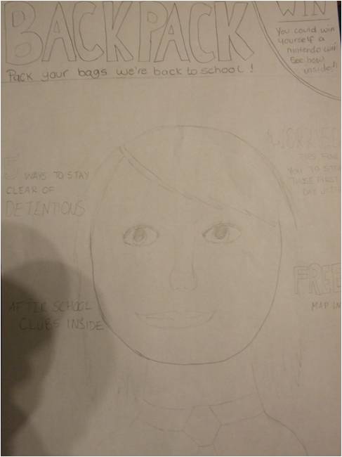
For the preliminary task we were required to create a front cover and a contents page for a school magazine. Before creating my magazine I decided to draw out some ideas on some A4 paper. Before sketching out the possible images and sell lines, I first thought of my masthead - eventually I decided to call my magazine 'Backpack' as I thought this directly related to my target audience of year 7's. I then went on to draw out the rest of my ideas on the paper.


Once I finished drawing out my ideas I used a digital camera to capture some of the images I wanted to include on my magazine front cover and contents page - once taken I uploaded these pictures onto the computer ready for me to create my magazine.
 I created my magazine front cover and contents page in Adobe Photoshop. I began by creating an A4 page by selecting the 'International Newspaper' option; this was then followed by inserting the images that I took. I decided to create my magazine front cover first therefore the first image I inserted was my main image (this opened up in a new window) - my main image consisted of a young student smiling at the camera. Having the model smiling at the camera created a friendly environment for the target audience therefore, this would be useful as it persuades the reader to buy the magazine as they find it appealing and welcoming. To cut my model out of the background I used the 'magic wand' tool to select the background, therefore I could simply delete the selection and it would leave me with just the model image - to smooth the edges and to edit the photo I used the 'heal tool'. I then dragged the image into the main A4 document. Next I created my masthead I did this by creating a new layer and using the ' horizontal text tool' to create a text box - in the text box I wrote the masthead 'Backpack', I decided to change the font to 'Impact' as this is quite a bold and eye-catching font, I then changed the colour to a bright red, the reason for this is because red is quite a bright and vibrant colour therefore it will attract the audiences attention. Underneath this (in the font Times New Roman) I added the tagline "Pack you're bags were back to school!" as the linked well with my masthead - I decided to change the colour of this to orange as it combined well with the red.
I now added in my various sell lines which all directly related to the audience of year 7's e.g. as year 7's will all be starting school one sell line which I included was: " Worried? The best tips to calm your nerves". I also varied the use of the colours orange and red to keep a consistent theme. These were again created using the 'horizontal text tool'.
 I now began to create my contents page which was also created in Adobe Photoshop. I again used the font 'Impact' for the title 'Contents' and I stuck with the red and orange colour scheme to create a continual theme. To the side of the title I added in the Haydon stag to reinforce the idea that this is a school magazine and to make the page look more professional. Next I added in the page numbers and titles - this was done by using the 'horizontal text tool' I then aligned the text to the left. Following this I inserted the rest of the images I took on the digital camera which included a picture of salad, a school bag, and two blacked out images of people. To cut these pictures out of the background I 'quick mask' tool - to blackout the images I just used the basic 'brush tool'. Around these three pictures I created a small box to put behind - I clicked on the fx button here I selected 'Drop Shadow', 'Outer glow' and 'Bevel and Emboss' to give a slight 3D effect.

Once I finished drawing out my ideas I used a digital camera to capture some of the images I wanted to include on my magazine front cover and contents page - once taken I uploaded these pictures onto the computer ready for me to create my magazine.
 I created my magazine front cover and contents page in Adobe Photoshop. I began by creating an A4 page by selecting the 'International Newspaper' option; this was then followed by inserting the images that I took. I decided to create my magazine front cover first therefore the first image I inserted was my main image (this opened up in a new window) - my main image consisted of a young student smiling at the camera. Having the model smiling at the camera created a friendly environment for the target audience therefore, this would be useful as it persuades the reader to buy the magazine as they find it appealing and welcoming. To cut my model out of the background I used the 'magic wand' tool to select the background, therefore I could simply delete the selection and it would leave me with just the model image - to smooth the edges and to edit the photo I used the 'heal tool'. I then dragged the image into the main A4 document. Next I created my masthead I did this by creating a new layer and using the ' horizontal text tool' to create a text box - in the text box I wrote the masthead 'Backpack', I decided to change the font to 'Impact' as this is quite a bold and eye-catching font, I then changed the colour to a bright red, the reason for this is because red is quite a bright and vibrant colour therefore it will attract the audiences attention. Underneath this (in the font Times New Roman) I added the tagline "Pack you're bags were back to school!" as the linked well with my masthead - I decided to change the colour of this to orange as it combined well with the red.
I now added in my various sell lines which all directly related to the audience of year 7's e.g. as year 7's will all be starting school one sell line which I included was: " Worried? The best tips to calm your nerves". I also varied the use of the colours orange and red to keep a consistent theme. These were again created using the 'horizontal text tool'.

Subscribe to:
Posts (Atom)